Page Not Found
. 1900Page not found. Your pixels are in another canvas.
A list of all the posts and pages found on the site. For you robots out there is an XML version available for digesting as well.
The combination of tidyr::nest() and purrr:map() can be used to easily fit the same model to different subsets of a single dataframe. There are many tutorials available to help guide you through this process. There are substantially fewer (none I’ve been able to find) that show you how to use these two functions to fit the same model to different features from your dataframe.
Since taking a job as a data scientist three months ago, I’ve spoken with multiple political science PhD students who are interested in potentially making the same transition. This post synthesizes what I’ve said in those conversations with what I’ve learned in my first three months on the job, and I hope it will be helpful to anyone in the same position I was six months ago.
When I was applying to graduate school and asking for letters of recommendation from my undergrad professors, one of them told me to give academia three years, and that if I hadn’t found a permanent position by then, to find another career. It’s been three years, and next week I start a new job as a data scientist. I read a fair bit of quit lit in my first couple years of grad school and always told myself that if I went that same route, I would never pen any of my own…
As part of the publication process for my recent article on how states preempt separatist conflict, I needed to submit replication materials to the journal. I took my graduate quantitative methods sequence with the late Tom Carsey, so I’ve long been a proponent replicability efforts in social science. I also had an hourly job in grad school replicating quantitative results for multiple political science journals, so I’m very familiar with best practices for replication. Unfortunately, in the four years since I wrote the first line of code for this project, somewhere in between defending my dissertation and starting a new job (ok, fine, almost immediately after writing that first line of code), I got a little lazy.
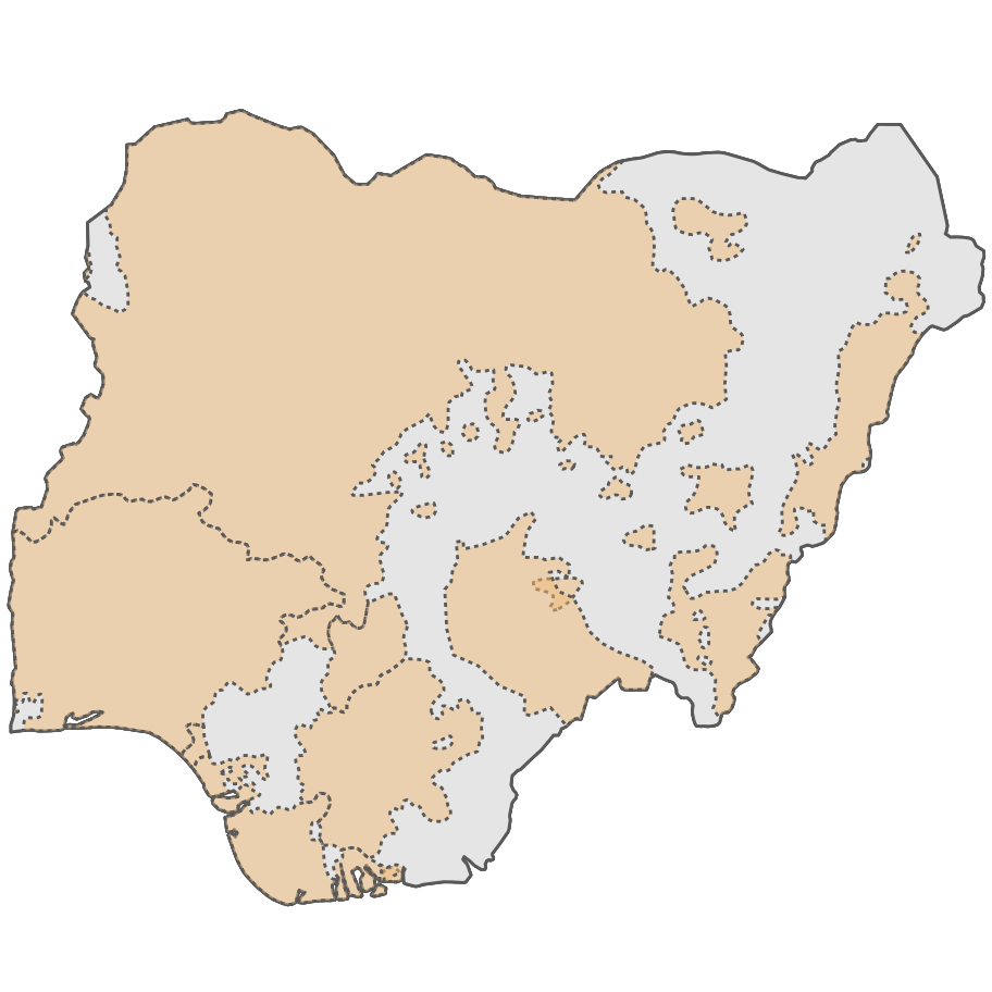
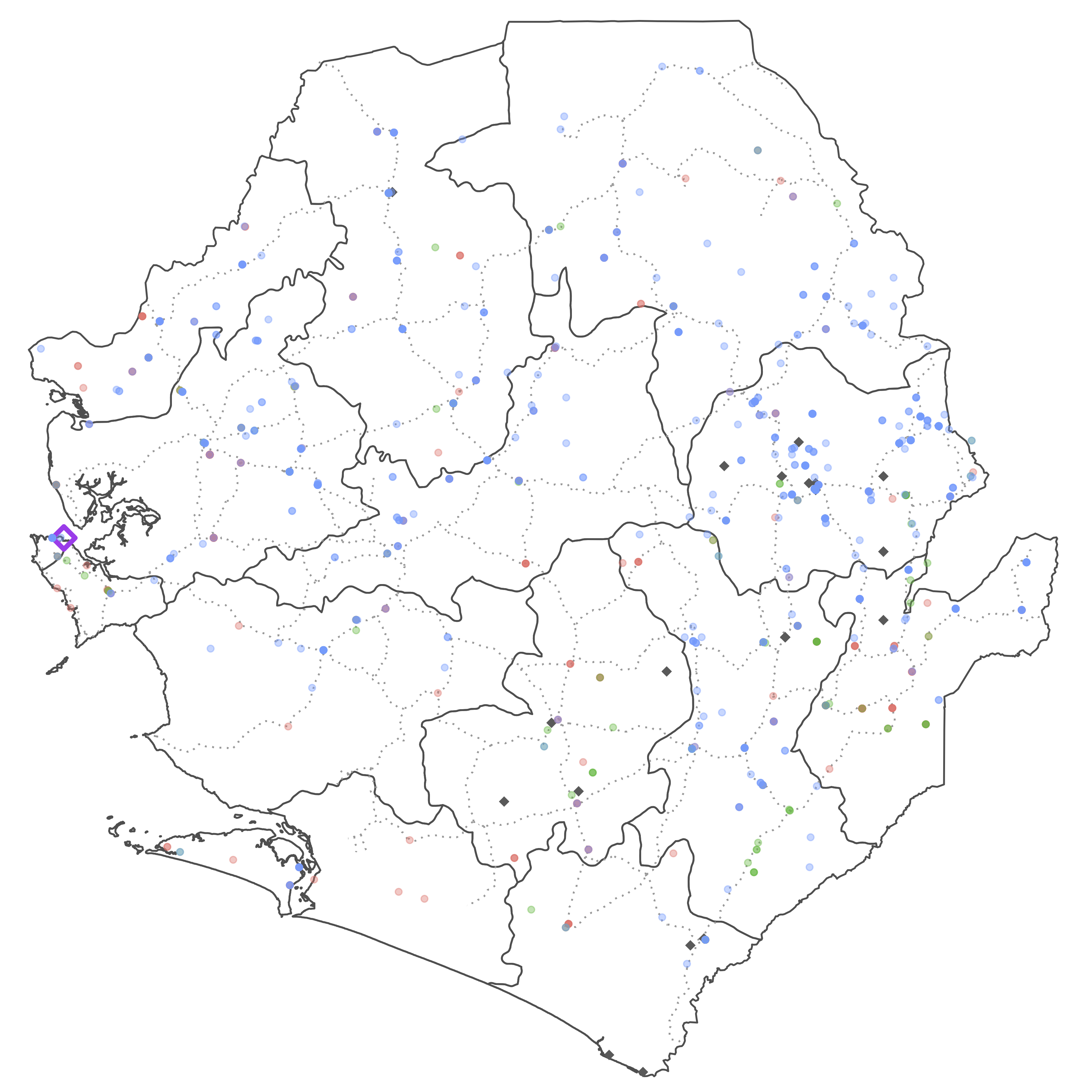
I recently needed to create a choropleth of a few different countries for a project on targeting of UN peacekeepers by non-state armed actors I’m working on. A choropleth is a type of thematic map where data are aggregated up from smaller areas (or discrete points) to larger ones and then visualized using different colors to represent different numeric values.
Like many people, I’ve been spending more time outdoors during this pandemic. While this means daily walks in my neighborhood, it also means getting out into the wilderness and sleeping in a tent when I can. Although outdoor recreation is one of the safer ways to entertain yourself these days, it’s not without its own concerns. The difficulty of safely getting to trailheads means that while I’m backpacking more than usual, it’s still not as often as I’d like.
In my research I frequently work with large datasets. Sometimes that means datasets that cover the entire globe, and other times it means working with lots of micro-level event data. Usually, my computer is powerful enough to load and manipulate all of the data in R without issue. When my computer’s fallen short of the task at hand, my solution has often been to throw it at a high performance computing cluster. However, I finally ran into a situation where the data proved too large even for that approach.
I’m currently compiling a list of university-affiliated programs designed to help prepare students for graduate study in political science and assist them in the process of applying to graduate school (a labyrinthine and opaque process in many regards). Since travel costs can be a deciding factor for some students when deciding whether to apply to these programs, I thought it would be nice to also put them on a map.
Some coauthors and I recently published a piece in the Monkey Cage on the recent military coup in Mali and the overthrow of president Ibrahim Boubacar Keïta. We examine what the ouster of Keïta means for the future of MINUSMA, the United Nations peacekeeping mission in Mali. One of my contributions that didn’t make the final cut was this plot of casualties to date among UN peacekeepers in the so-called big 5 peacekeeping missions .
One thing I haven’t covered in my previous posts on creating and customizing an academic website is how to actually add content to your site. You know, the stuff that’s the reason why people go to your website in the first place? If you’ve followed those guides, your website should be professional looking and already feeling a little bit different from the stock template. However, adding new pages or tweaking the existing pages can be a little intimidating, and I realized I should probably walk through how to do so. Luckily Jekyll’s use of Markdown makes it really easy to add new content!
This is a followup to my previous post on creating an academic website. If you’ve followed that guide, you should have a website that’s professional-looking and informative, but it’s probably lacking something to really make it feel like your own. There are an infinite number of ways you could customize the academicpages template (many of them far, far beyond my abilities) but I’m going to walk you through the process I used to start tweaking my website. The goal here isn’t to tell you how you should personalize your website, but to give you the tools to learn how to implement whatever changes you want to make.
If you’re an academic, you need a website. Obviously I agree with this since you’re reading this on my website, but if you don’t have one, you should get one. Most universities these days provide a free option, usually powered by WordPress (both WashU and UNC use WordPress for their respective offerings). While these sites are quick to set up and come with the prestige of a .edu URL, they have several drawbacks that have been extensively written on.
Much has been written lately about the increasing militarization of US law enforcement. One of the most visible indicators of this shift in recent decades is the increased frequency of tactical gear and equipment worn and carried by police officers. However, this pales in comparison to images of police departments bringing armored vehicles to peaceful protests.
14 pt periods. 1.05” margins. 2.1 spaced lines. Times Newer Roman. I’ve seen them all, and I’m tired of trying to catch them. So, I’ve stopped assigning papers in terms of page length and switched to word counts. Unfortunately, counting words is more time-intensive than counting pages.
Everyone knows that Beamer makes frankly terrible presentations without a good deal of help. A well crafted Beamer presentation can be a thing of beauty, especially since you can use knitr or R Markdown to automatically generate tables and figures, but it takes a lot of work.
I’m currently cleaning and wrangling a large (> 2 billion observations) dataset. Due to its size, I’m running code in batch mode on a remote cluster. Not running interactively makes it harder for me to check on my code’s progress.
My previous post on combining multiple PDF files had an important caveat that things would end up in the wrong order if you had files with leading ID numbers that started at 1 and ended at 12, you’d end up with PDFs combined in the order 1, 10, 11, 12, 2, 3, …, 9.
How many times have you found that your institution has access to a digital version of a book you need only to discover that it comes in 15 different PDF files?


